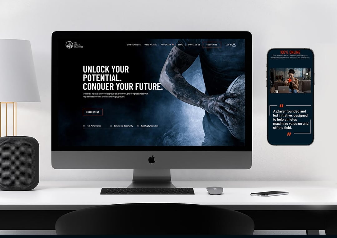
The AC is an organisation that provides a holistic approach to rugby player development, supporting athletes in performance, mental skills, leadership, and personal brand growth while maximizing commercial opportunities. It also prepares athletes for life after rugby through career planning, mentorship, and professional development, ensuring a confident transition beyond the sport.

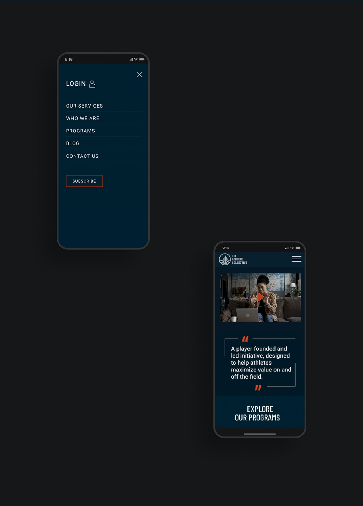
The goal of this project was to improve the overall user experience on the site (i.e., the customer journey and the website’s overall flow and clarity. The AC team also wanted to improve the AC brand’s perceived value by integrating more of the brand's personality through animations, graphic design and the use of photography and imagery.

The goal of this project was to improve the overall user experience on the site (i.e., the customer journey and the website’s overall flow and clarity. The AC team also wanted to improve the AC brand’s perceived value by integrating more of the brand's personality through animations, graphic design and the use of photography and imagery.
