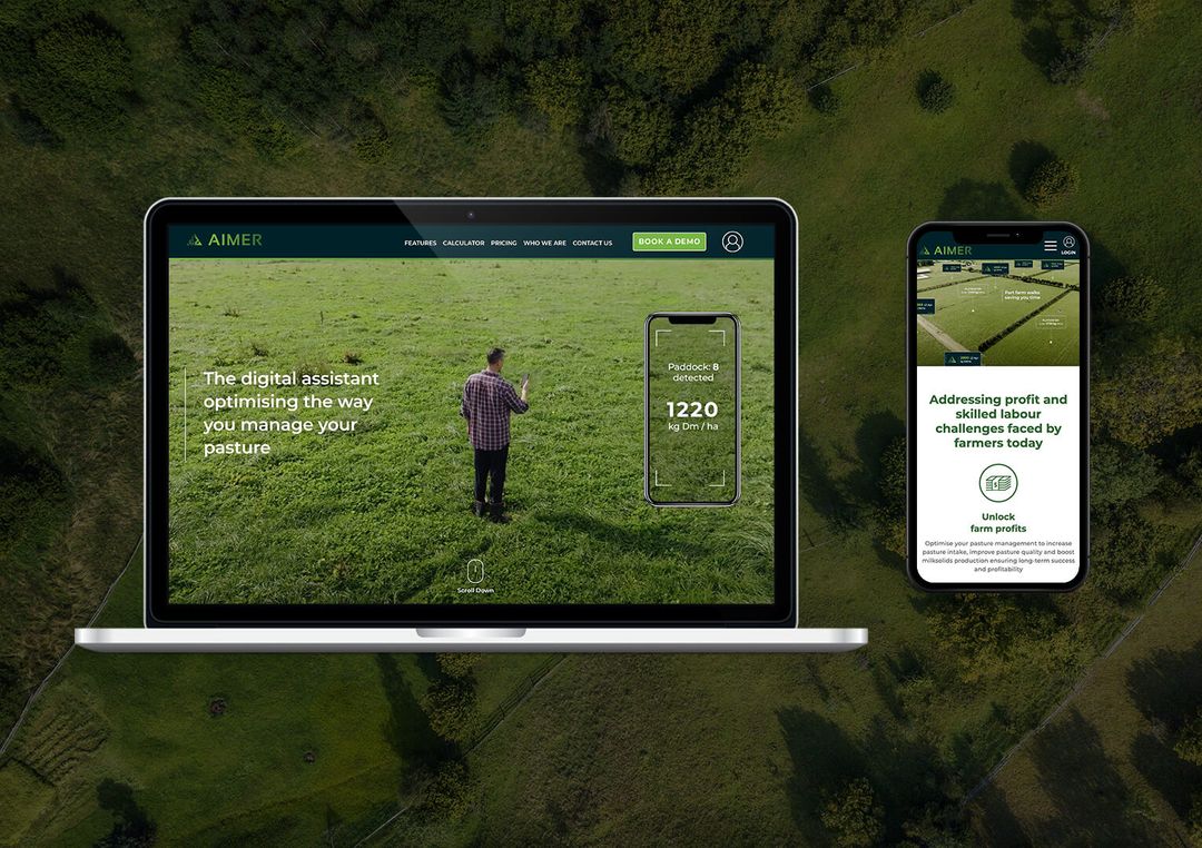
Kreval Hawk Macbook Pro
Aimer Farming Demo screen

The Challenge

One of the projects challenges was to produce a creative design that excites the targeted audience and potential investors in a meaningful and engaging way. Meaning, communicating ProTag’s point of difference 'continuous 24/hr tracking' of each cattle was something we wanted to get right.

And through strategic phases in our wireframes, and copywriting iterations made through collaborations with the start-up founders and our small team we implemented a hero video right in the beginning to set the tone and the mood for the rest of the site. It was important that the design, interactive section and video not only captures and effectively communicates crucial aspects of the technology but to also visually align with the brand goals. Create something "visually satisfying".

As a home page focused website, the project did not come without its challenges, but through determination and hard work to produce the highest possible outcome for our client was front and centre in what we do. We are very happy with what we achieved and hope you enjoy what you see.

Strategy


Discovery –
These initial stages are always crucial and form an invaluable part of our process. We gather and analyse all the critical information required for the project before moving on to any design or development work. We collaborated closely with Jeremy and the team to discuss the project's objectives, gain a clearer understanding of the business, assess the current product, products in development, and future possibilities. 

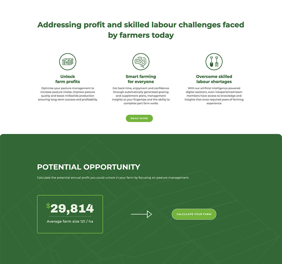
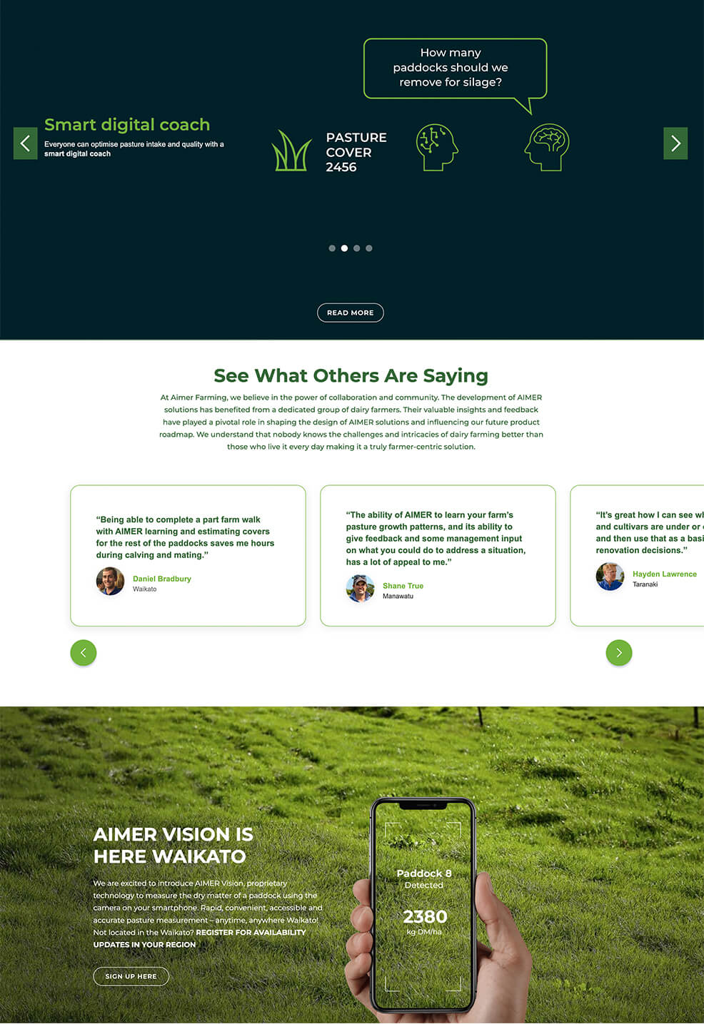
We built our structure through continuous communication with Jeremy's team. Kreval Hawk Digital ensured design alignment with business goals and brand, defining elements, site structure, and organising content, including hero videos, benefits, a pricing calculator, and more. We prioritised content and conveyed the project's narrative, even for elements in development like 'AIMER Vision,' keeping customers excited about upcoming developments.

Process – With the gathered information, our process was straightforward: wireframes for UX, visual design for UI, iterations, development, testing, and launch. Initially, we structured and prioritised content using wireframes to define the flow, determining how much space to allocate to each section and where to place important content. Next, we progressed to creating a mood-board to align with the client's expectations of the site's potential appearance. Following this, we designed the UI, incorporating brand colours, fonts, and images. Additionally, we produced the hero video and other feature animations in this process.

Deliver – After the design was finalised and all brand elements were in place, video creation was completed. Development, including mobile and tablet-friendly versions, was implemented. We ensured that calculators and animations were functioning smoothly. Once this was completed, we conducted the CMS system integration for the blog pages and thoroughly tested the site before launching it live.

Kreval Hawk AIMER Farming wireframes
Aimer Farming Demo screen

Responsive Design

mobile image responsive
desktop screen 4